Look Up, Then Plan Down: Giving British Ceilings a Proper Bit of Thought
We spend hours choosing paint for the walls, agonising over rugs and moving the sofa two inches to the left. Then we look up and remember the ceiling exists. In most British homes it is a plain expanse of white, maybe with a hairline crack and a pendant that came with the house. That is a shame, because the ceiling is not just the lid on the room. It decides how tall, how calm and how finished everything else feels.
The good news is that you do not need to scaffold the hallway or commission a hand-painted fresco. A modest spend up there, often less than re-papering a feature wall, can change the whole mood of a room. The trick is to work with the ceiling you actually have, not the one you wish you had.
Start with the height you actually have
British ceilings are not one thing. A Victorian terrace might give you a low, boxy room where the ceiling feels close enough to touch. A Georgian townhouse might offer proportions that make your furniture look like dollhouse pieces. A 1930s semi sits somewhere in the middle, and a new-build often has a decent height but very little character. The ceiling plan should follow that reality.
In a low Victorian room, usually around 2.4 metres, the instinct is to paint everything brilliant white and hope for the best. White helps, but a stark white ceiling can actually emphasise the hard line where wall meets ceiling. A softer off-white, or the same colour as the walls in a slightly lighter finish, blurs that edge and makes the room feel less boxed in. Avoid heavy cornice, deep ceiling borders and busy patterned wallpaper right up to the ceiling line. Keep pendants short and close to the ceiling. A flush light or a small semi-flush fitting will do more for the room than a long drop that you have to duck around.
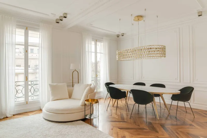
Tall Georgian rooms can take more. A deeper colour on the ceiling, a longer pendant drop and a proper ceiling rose all make sense when there is space to breathe. The ceiling can be the quiet drama of the room rather than a blank afterthought. If the room is already grand, you do not need to add much. A well-proportioned rose and a simple pendant can be enough. If it is tall but plain, a soft colour on the ceiling and a longer drop light will stop the upper third of the room feeling like a forgotten void.
Cornice, roses and the period grammar
Period details are not compulsory, but they are useful clues. If your room already has cornice, repair it rather than rip it out. If it does not, adding a deep ornate cornice to a 1960s box room will look like a costume. A simple plaster coving or a clean shadow gap can be just as effective, and often cheaper.
Picture rails are worth a mention because they change how you read the ceiling. In a period home, a picture rail gives the eye a horizontal line to rest on, which can make a tall wall feel more composed. Painting the rail the same colour as the wall keeps it subtle; painting it a contrast colour makes it a feature. Neither is wrong, but be consistent. If the ceiling is already busy with cornice and a rose, let the walls do less.
Ceiling roses are having a quiet moment again, partly because they are an easy way to make a plain pendant look intentional. The rule is proportion: a small rose in a large room disappears, and an enormous rose in a small room looks like a wedding cake. Match the rose to the light fitting and the room, not to the biggest one in the DIY shop. If you are renting, a lightweight ceiling medallion that fits around the existing pendant can be a deposit-safe compromise, provided you check with your landlord first.
The paint question: when a coloured ceiling works
A coloured ceiling is not automatically cosy, and a white ceiling is not automatically safe. It depends on light, height and how the room is used. In a north-facing living room with small windows, a dark ceiling can swallow what little light you have. In a dining room used mostly after dark, a deeper ceiling colour can make the room feel enveloping and intimate.
One reliable trick is the colour-drench approach: paint walls, ceiling and woodwork in closely related tones. In a low room, this blurs the boundaries and makes the ceiling feel higher because your eye is not constantly hitting a contrast line. In a tall room, a slightly darker ceiling pulls the space down and makes it feel more human. Avoid high-gloss ceilings unless you are in a bathroom or a very specific mood. Matte or eggshell is more forgiving and shows fewer imperfections.
Always test a patch first. Ceiling paint looks different once it is up there, partly because light hits it from below and partly because you are rarely looking at it straight on. A sample pot is cheaper than repainting a whole room because the colour turned out to be a very expensive mistake.
Pendants, placement and the practical bit
The centre of the ceiling is not always the centre of the room, and the centre of the room is not always where you need light. In a dining room, the pendant should hang over the table, not over the middle of the floor. In a living room, a pendant in the middle of the ceiling can be fine for general light, but it rarely helps you read or relax. Layer in floor and table lamps so you are not relying on one bulb overhead.
Height matters. A low ceiling wants a short drop or a flush fitting. A tall ceiling can take a longer pendant, but make sure it does not dangle into the sightline of anyone walking through. If you have a ceiling rose, the pendant should sit centred within it. If you have a beam or a change in ceiling height, do not fight it. Work with the architecture rather than pretending it is not there.
Shadow-gap lighting and LED cove details are popular in new builds and renovations because they wash the ceiling with light without adding visible fittings. They can look very smart, but they are best planned before the plastering stage. In an older home, a simple uplighter in the corner or a picture light can create a similar glow without chasing cables into the ceiling. Renters should stick to plug-in uplighters and lamps; ceiling alterations are rarely worth the deposit argument.
The budget order that actually makes sense
If you are going to spend a little money on the ceiling, do it in this order. First, paint it properly. A fresh coat of the right colour is the cheapest transformation in the room. Second, sort the pendant. A better fitting and a warm, dimmable bulb will do more than a fancy shade that is too small for the space. Third, add one architectural detail if the room wants it: a simple rose, a run of coving or a painted border. Fourth, consider lighting layers that wash the ceiling rather than just lighting the floor.
The ceiling is not the forgotten wall. It is the surface that frames every wall, every window and every piece of furniture you have spent months choosing. Give it a bit of thought and the whole room stands up straighter.